Peerbie Website Redesign
Transforming Peerbie’s Website: Designing an Interactive and Engaging User Experience
Year
2023
Client
Peerbie
Category
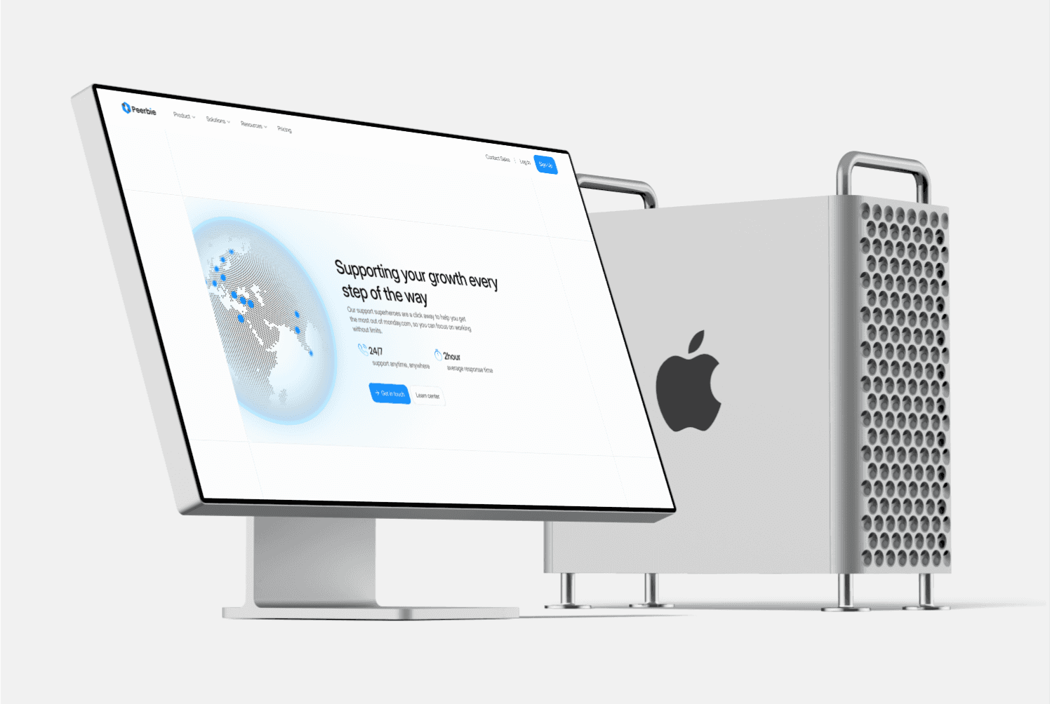
Website Design
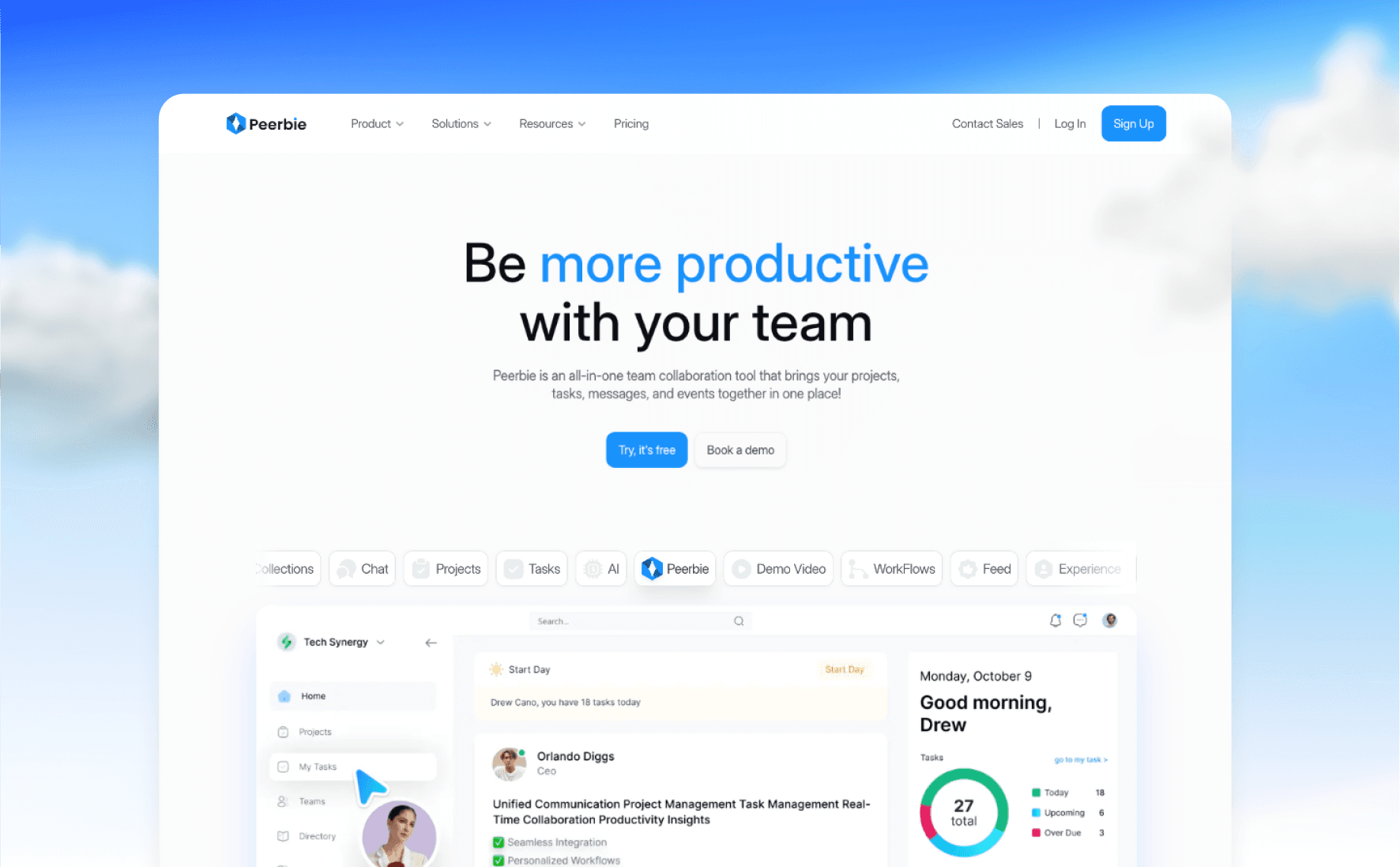
When designing the Peerbie website, the challenge wasn’t just about presenting features—it was about creating an experience that reflects how Peerbie helps teams collaborate, plan, and execute effectively. The focus was to make the website a natural extension of the product itself: interactive, engaging, and intuitive. By building the narrative around actionable sections like Communicate, Collaborate, Plan & Execute, and Analyze, the goal was to guide users through Peerbie’s core value in a way that feels seamless and engaging.
Design Decisions and Innovations
1. Section-Based Content Organization
To ensure clarity and focus, Peerbie’s features were grouped into distinct sections that align with user workflows: Communicate, Collaborate, Plan & Execute, and Analyze. This structure not only improved navigation but also helped users identify the platform’s key offerings quickly. Each section was enhanced with interactive highlights—such as hoverable feed posts, drag-to-schedule Gantt charts, and toggleable report views—that allowed users to experience Peerbie’s functionality without leaving the page. This interactive approach bridged the gap between static content and product exploration.
2. Dynamic Transitions and Micro-Interactions
One of the core design principles was to keep users engaged throughout their journey. Dynamic transitions between sections created a narrative-like flow, ensuring users didn’t feel overwhelmed or lost. Sticky navigation helped users stay oriented, while micro-interactions brought subtle delight to the experience. For example, task cards on the website simulate Peerbie’s real-time collaboration features: hovering over tasks highlights action buttons like "Assign" or "Mark Complete," mimicking the platform’s functionality.
3. Visual Hierarchy and Accessibility Improvements
A clean and bold visual hierarchy was essential to make the website feel professional and approachable. High-contrast colors, bold action buttons, and clear typography improved readability and accessibility. Interactive elements like buttons and toggles were intentionally styled to stand out, guiding users through the site effortlessly. Placeholder text and icons were redesigned for clarity, ensuring every element aligned with the overall aesthetic while being fully functional and user-friendly.


Why These Design Changes Matter
The combination of section-based storytelling, dynamic transitions, and micro-interactions allowed the Peerbie website to communicate its value in a more immersive way. Users weren’t just reading about the platform—they were experiencing it. This approach eliminated the disconnect between the website and the product, making the entire experience cohesive and engaging.
Impact on User Engagement
These design improvements had a measurable impact on key engagement metrics:
Click-Through Rate: Increased by 50%, driven by clear CTAs and interactive elements that encouraged deeper exploration.
Bounce Rate: Reduced significantly as users stayed longer on the site, exploring dynamic features without feeling the need to navigate away.
User Satisfaction: Feedback indicated that users found the site more intuitive and enjoyable, with many commenting on the value of experiencing the product directly through the site.
Conclusion
The Peerbie website redesign transformed a traditional informational site into a storytelling and interactive experience. By focusing on user behavior and integrating dynamic design elements, the website now communicates the value of Peerbie in a way that engages and inspires users. This approach not only improved engagement metrics but also strengthened Peerbie’s position as a leading collaboration platform. The new design proves that a website can do more than inform—it can captivate and convert.