Peerbie App Design
Peerbie Chat 2.0
Year
2024
Client
Peerbie
Category
Product Deisgn

Overview
Peerbie’s original chat was built for the basics—sending and receiving messages. It worked, but it didn’t quite meet the needs of B2B users. So in the 2.0 version, we redesigned it from the ground up with a sharper focus on usability, structure, and AI integration.
Problems We Tackled
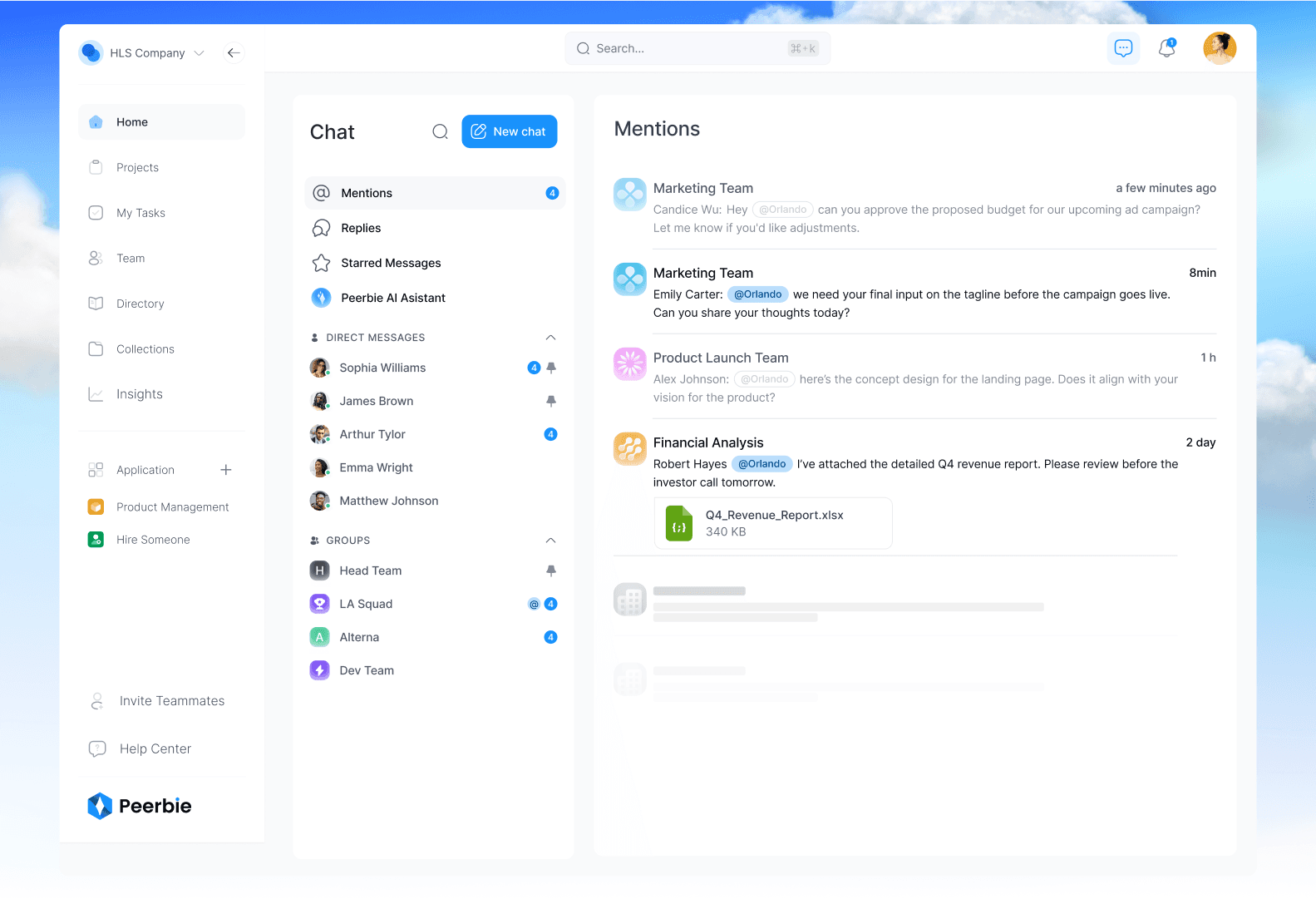
One of the first things we noticed was that users struggled to access their mentions and replies quickly—a pretty big deal in a busy team environment. So, we added dedicated sections for both in the sidebar, making it easier to stay on top of what matters.
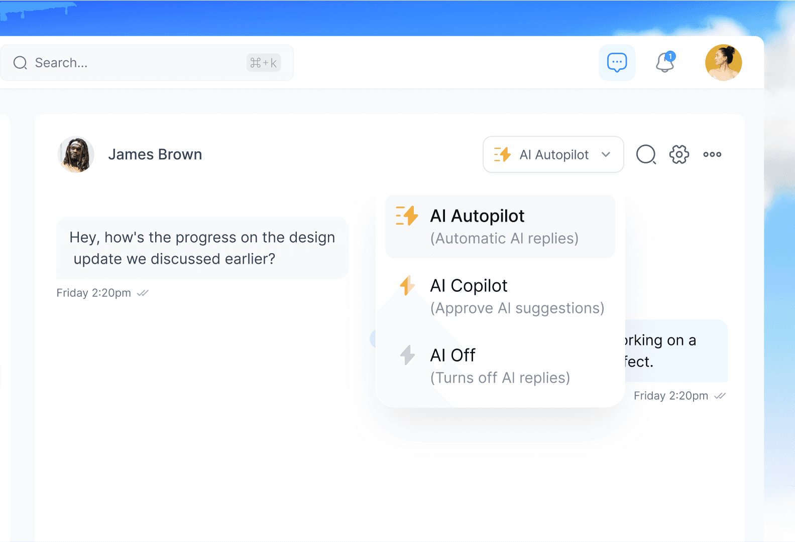
Smarter with AI
We also introduced a new layer: Digital Twin Mode. From the header dropdown, users can now choose between Co-Pilot, Auto-Pilot, or AI Off. This small addition gave users more control over how they interact with AI assistance inside the chat—without ever breaking their workflow.
Resault
The redesigned onboarding flow led to significant improvements:
Increased User Retention: A noticeable decrease in drop-off rates during the onboarding process.
Positive User Feedback: Users reported a more enjoyable and less cumbersome onboarding experience.
Higher Engagement: New users began utilizing Peerbie's features more quickly, leading to faster adoption.
Design Improvements
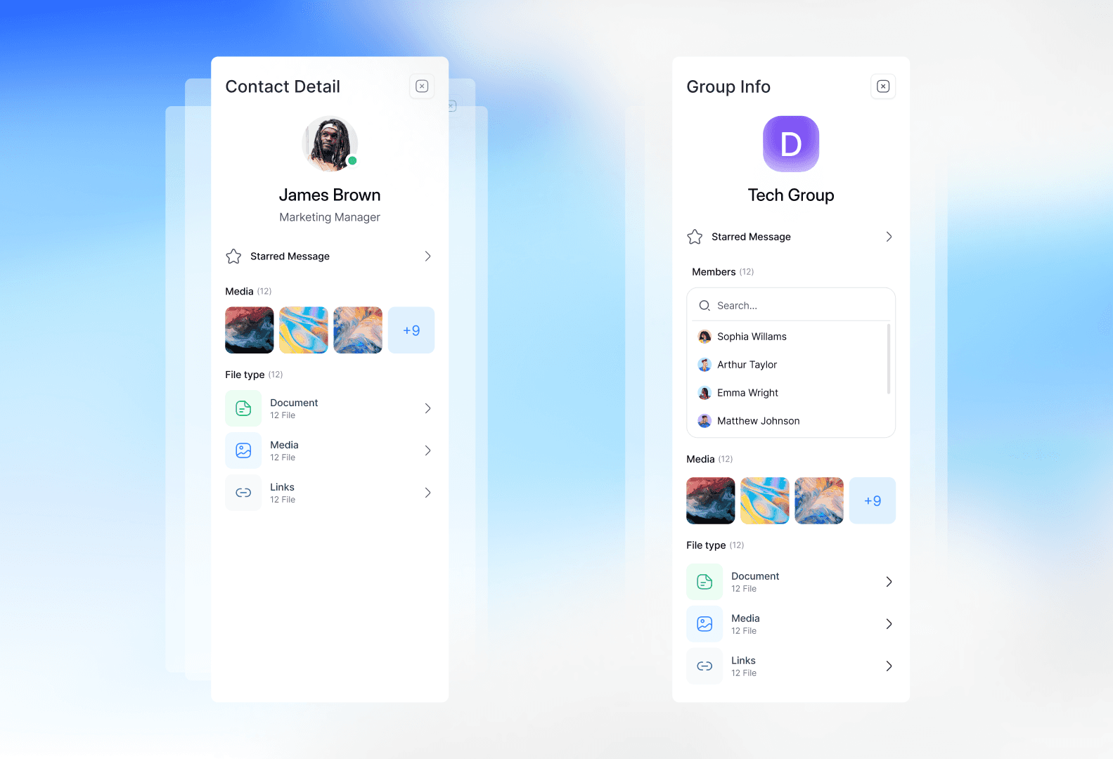
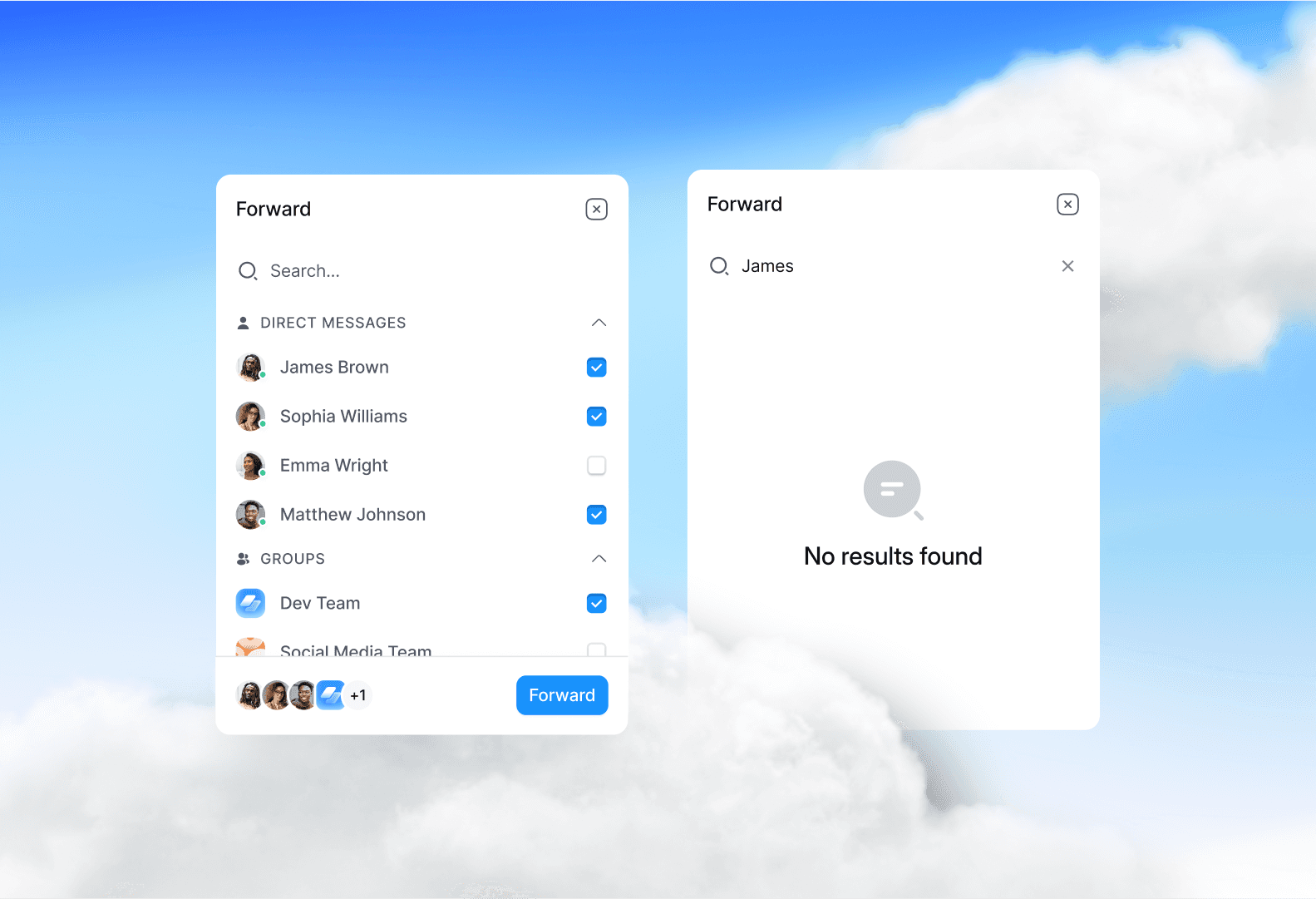
Besides all that, we cleaned up the UI and brought in a more modern, flexible layout. Features like replies, forwards, and better message actions were redesigned to feel lighter, faster, and more intuitive.
Conclusion
Peerbie Chat 2.0 isn’t just cleaner—it’s smarter and built to match the needs of teams that rely on speed, clarity, and flexibility in their daily communication.